W
e’re constantly trying to make Airmeet a better experience for both organizers and attendees. In that pursuit, we’re bringing some UI changes to our platform.
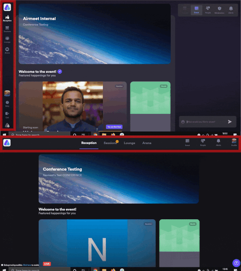
Moving the Event Navigation from the left column to the top row
We’re making it easier to navigate through the event, moving the navigation interface from the left to the top of the screen. While it looks different, however, we have NOT changed any functionality.
You can continue to use the navigation on the top as you did before. According to our user testing interviews, moving navigation to the top offered a more immersive experience for the attendees.
Collapsible Right Hand Side Panel
To reduce clutter, we have made the right-hand side panel collapsible. By default, it’s closed until attendees click on any of the features on the top right. By clicking on any feature like ‘Event Feed’ or ‘Alerts’, you can make the right-hand side panel visible.
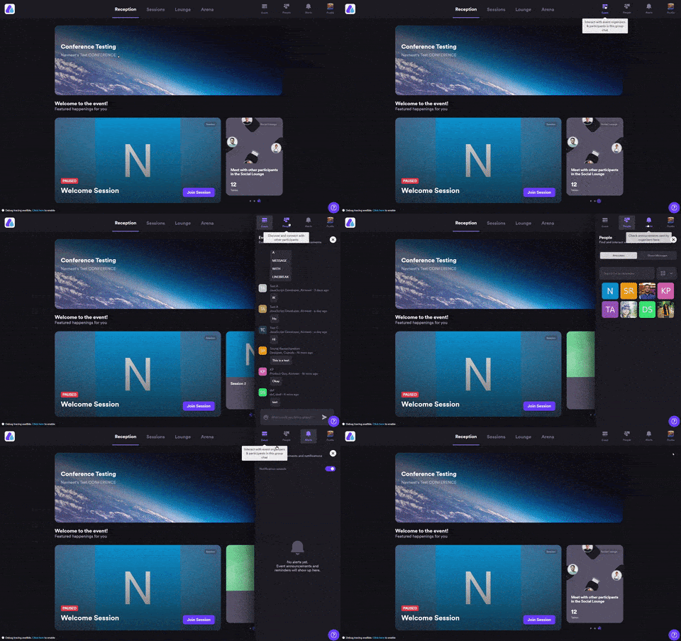
Also, we have added a close icon to allow attendees to close the panel and have more real-estate on the screen for an immersive experience.
Separate Event and Session Feed
While the right panel is closed in the default state, the session chat and attendance will still be shown to the attendees, once they’re inside a session.
Whereas, event-wide features like “Feed” and “Alerts” can be accessed by clicking on the top right icons which open over the session chat and attendance tab. The close button can be used to go back to viewing only the session chat and attendees.
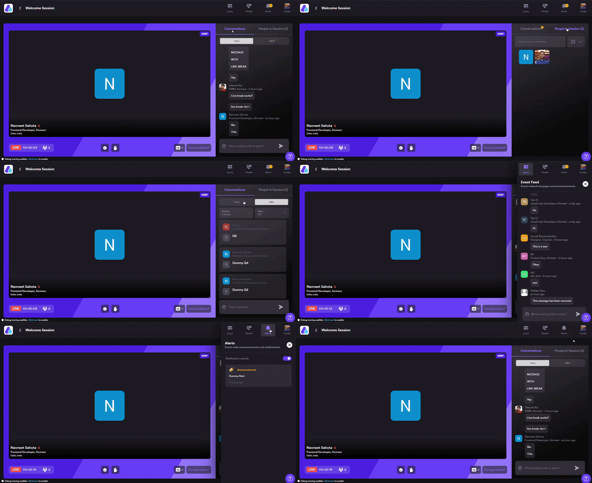
Along with these changes, we have also reduced distractions for the attendees by removing event navigation from the top row. To access that, the attendee must first exit the session using the back icon on the top left and then use the event navigation on the top to go to the booth, lounge, or reception.
Note: These new UI updates will be live on Thursday, 25th February 2021, and will only be available for your Airmeet conferences.






Congratulations to the wonderful team at Airmeet. I appreciate your love and passion for amazing software that is helping the world during these dark times. Thank you for listening to your users and going above and beyond to support our virtual events!
Thank you so much for such appreciative words, Eric. <3
Nice upgrade to the UI!
Thanks a lot, John. 🙂
Thanks for a great UI update! I just wished “Arena” was named “Booths”, as this is more intuitive to understand for attendees.
Hello, we’ve renamed Arena to Booths 🙂